 |
|
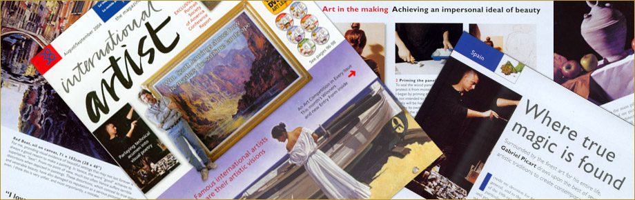
Gabriel Picart
was invited by the prestigious International Artist magazine to be the
artist from Spain in issue #38 (August 2004). A description of the
specifics of his technique was included in the feature article on him,
under the title
“ART IN THE MAKING
-
Achieving an impersonal
ideal of beauty
”. |
 |
 |
|
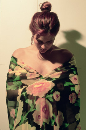
1.
Choosing the right model. My wife Rosa often serves as my model. Her
regular features tend to an academic ideal, and this way I can escape
the trap of figurative realist painters, which is making the painting of
the model look like the portrait of the woman who posed. In my
figurative work, I try to achieve an ideal of beauty that is impersonal,
and I avoid reproducing contours and shapes that might look distinctive
of a specific person. After posing her in the costume I had chosen for
arranging the lighting, I took many photographs of her. This one became
my main reference. |
|
 |
|
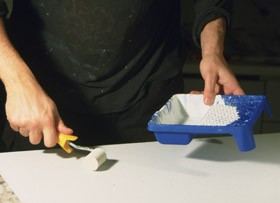
2.
Priming the panel. To seal the wood panel surface and protect it from moisture, mold and
rot, I began by priming it.
(Though a painting is not intended to be outdoors, and surely will be
handled and placed with care by its owner, any precaution that will help
the artwork endure for ever does not hurt.)
After applying the priming with a roller, I sanded down the surface to
make it smooth. |
|
|
 |
|
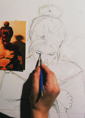
3.
Drawing with care. Next, I roughly sketched in the composition with
bold strokes of a colored pencil directly on the panel. Then I started
making the charcoal drawing. I did it carefully and in great detail, no
matter that it must be fully covered by paints later on. I consider this
well worth the work and not a waste of time, because it is the framework
for my future painting. |
|
|
 |
|
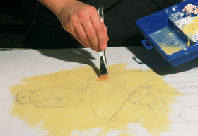
4.
Establishing a ground. Next, I laid down a pale ochre acrylic wash over
the entire surface for two reasons. One is that I do not like painting
on a white surface, and this colour set a warm tone for the painting.
The other is to create another isolating layer to prevent successive
layers of oil paint from penetrating through the smallest pores left in
the primer. |
|
|
|
|
 |
|
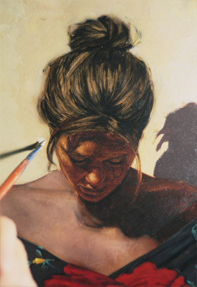
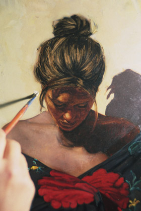
5.
Laying down the first glaze. To me, the
two most important qualities of oils are brightness and transparency. At
least, these
have been their most praised qualities, and the ones that gave them their place in
painting art. It is the technique of adding thin layers of
transparent oil that gives the illusion of depth and light. I work in
this manner, though not the same way in all the pictorial elements of the
painting. I apply the most number of glazes on figures, and mainly when
working on the skin areas. In other elements, such as backgrounds, where I may
use a palette knife even, I apply fewer glazes, mainly to modify colour. My first application of glazes began to define the forms
with values and colour. |
|
|
 |
|
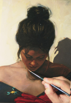
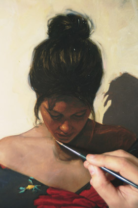
6.
Enhancing with a second glaze. Here you can see how I
added a second glaze of colours to continue building up and refining the
values and colours while modeling the forms. |
|
|
 |
|
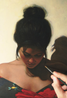
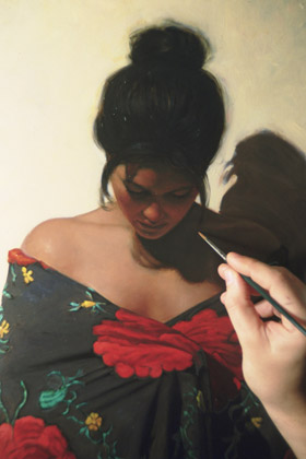
7.
Softening to completion. Due to the face being in shadow, much detail was not
required. Notice how the third transparent glazes, applied over the
others, make outlines look blurred and create a slight suggestion of
fading colour, or 'Sfumato'. To me, this is the key to success in making a
realistic painting that pretends to imitate reality. |
|
|
 |
|
To protect "Visual Poem" (oil on panel, 127 x 64 cm or
50" x 25"), I coated it with a varnish that is neither too shiny nor
too mate.
|
|
|
|
WHAT I USED |
|
|
-
Support. Panel is
my current favourite surface, as opposed to canvas. Among other
things, it always looks flat and stiff, unlike canvas that must be
strengthened regularly.
-
Oil colours.
Titanium White, Naples Yellow Red, Gold Ochre Transparent,
Light Oxide Red, Mars Orange, Naples Yellow Deep, Cadmium Orange,
Cadmium Yellow, Cadmium Red Deep, Violet, Madder Carmine Deep,
Cobalt Blue Deep, Kings Blue, Prussian Blue, Cinnabar Green, Olive
Green, Viridian, Sap Green and Ivory Black.

◄
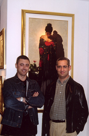
"Visual Poem" at the Weinstein Gallery - March
2002, San Francisco, California. |
|
|
|
|
|
IMPORTANT.
This description of the specifics of
my technique was performed in 2004. Although my painting technique essentially remains
the same, since then I have added some variations. For example, the frequent use of different shades of gray
(grisaille) instead of a monochrome background, such as pale ocher in the case of this
demonstration.
—
GP |
|